
可视化设计/PPt/UI全流程素材
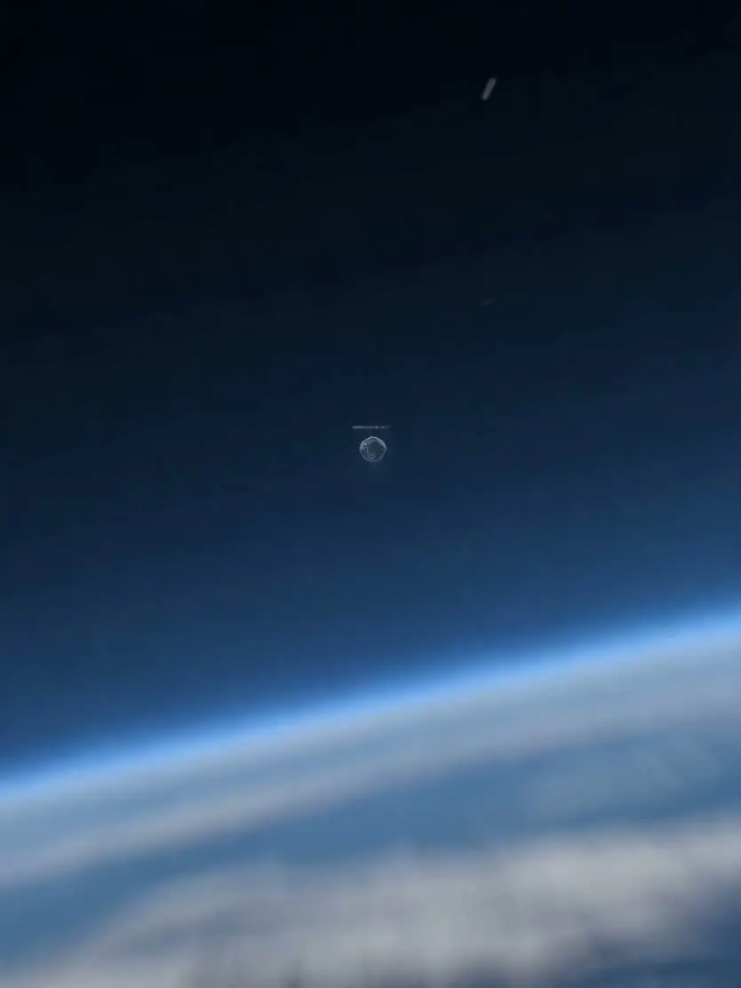 视频截图
可视化设计图标中的信息逐步显示展开,中间的地球在缓慢旋转
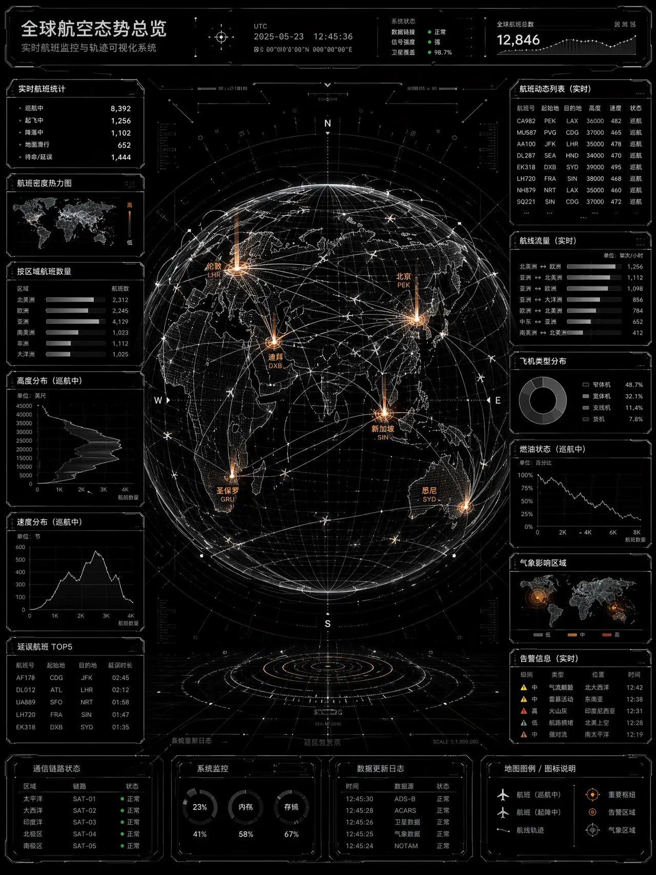
全中文版本,全球飞机飞行轨道路线可视化设计图,主要是黑白配色,仅球形地球的板块上有极少部分的重要信息和图形用琥珀橙色
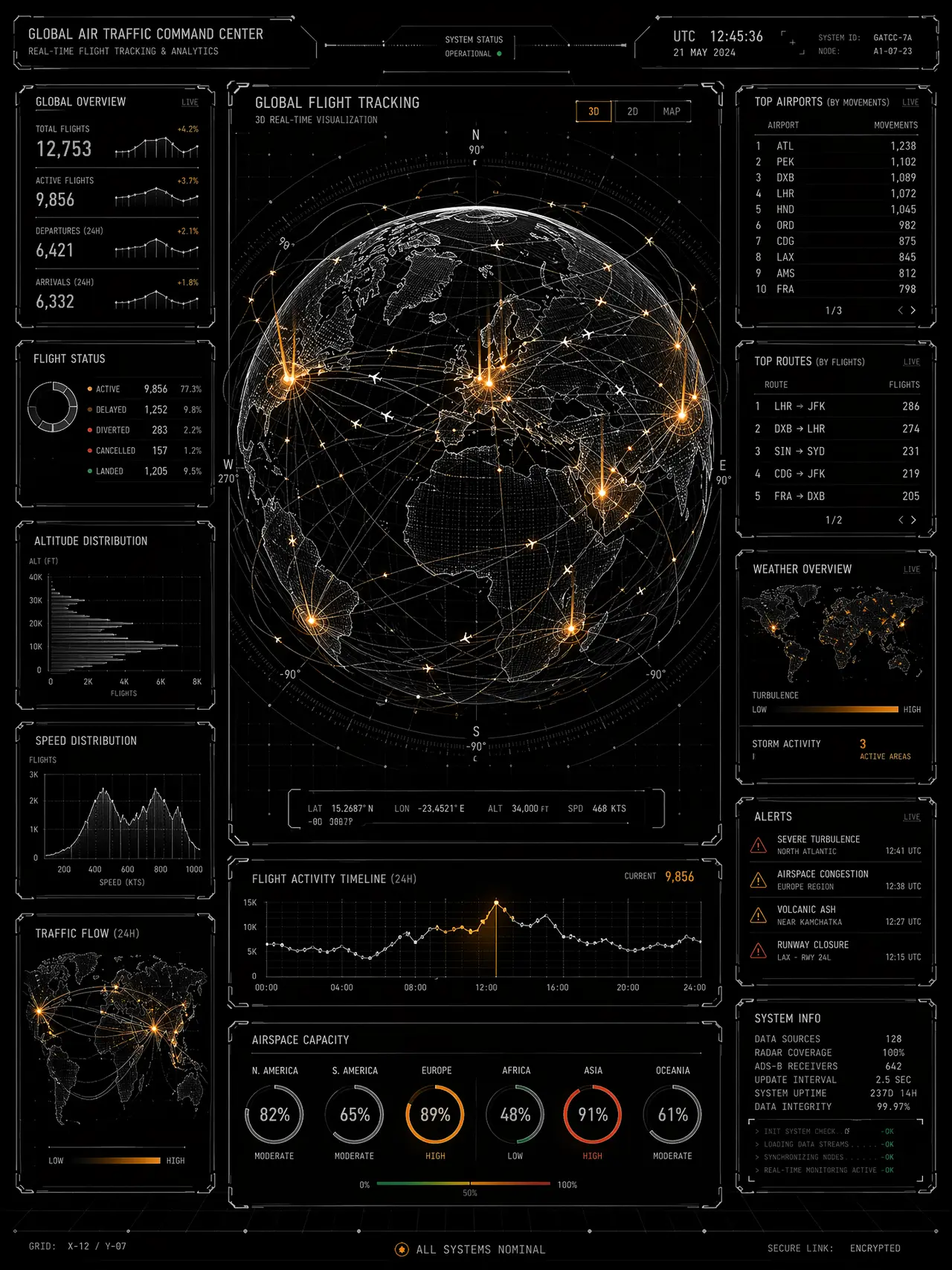
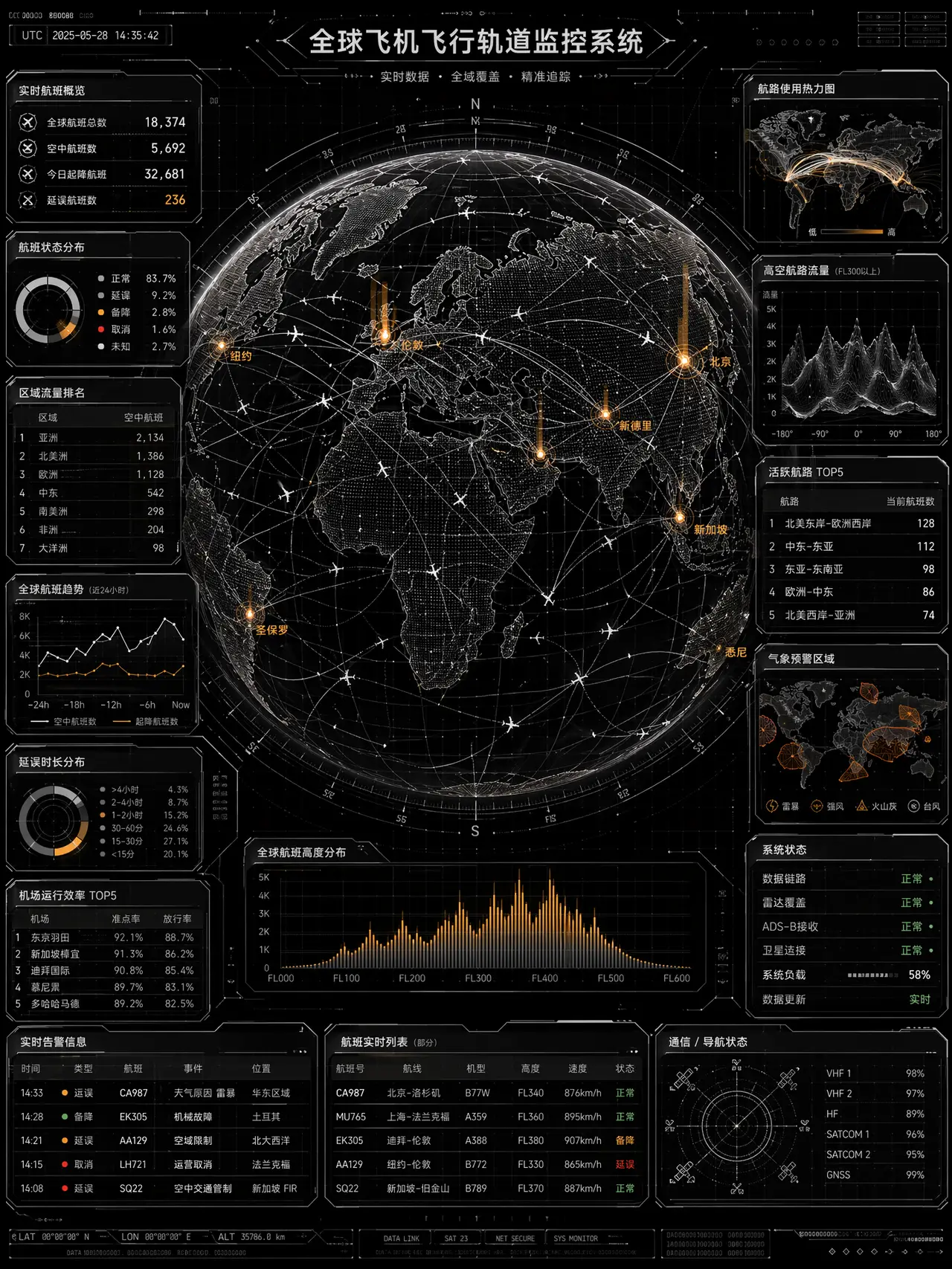
纯英文版本,全球飞机飞行轨道路线可视化设计图,主要是黑白配色,极少部分的重要信息和图形用琥珀橙色
【生成内容】 ### 整体设计风格 (Overall Design Style) - **FUI/HUD 界面美学**:摒弃了所有的实体拟物化设计或大面积色块,全面采用\*\*“线框化”(Wireframe)\*\*表达。无论是地球模型、折线图还是地图,全部由细密的网格、点阵和极细的线条构成,呈现出强烈的“透视感”和“全息投影”效果。 - **极客与军工级精密度**:画面中充斥着大量的**微观修饰纹理(Micro-textures)**,如:十字准星(Crosshairs)、边角折线(Corner brackets)、微小的坐标刻度、滚动的代码流等。这些元素即便看不清具体内容,也极大增强了界面的专业、硬核与高精尖的科技质感。 - **冷峻的数据理性**:没有多余的装饰插画,完全以数据为导向。风格极为克制、理性,传递出一种高效、精准、不容置疑的“监控室”氛围。 ### 2. 排版与布局 (Layout & Composition) - **绝对的“核心-护卫”构图(Center-Dominant Layout)**: - **视觉黑洞**:画面正中央的 3D 线框地球占据了最大的面积,作为不可撼动的绝对视觉中心,掌控全局视线。 - **双侧翼护卫**:所有的二维数据图表(折线图、表格、面板)被严格限制在画面的最左侧和最右侧,形成两道对称的“数据侧边栏”,如同主控制台两侧的辅屏,烘托中央的主体。 - **模块化与舱体式封装(Modular Containment)**: - 信息排版拒绝散落,每一个图表、每一组数据都被严格封装在带有科技感边框的\*\*“独立视窗/模块”\*\*内。 - 模块边缘大量使用切角、断线、科技装饰条进行修饰,使得整个版面看起来像是由一块块精密硬件拼接而成的仪表盘。 - **严丝合缝的网格系统(Rigid Grid System)**:底部的背景隐约可见细密的网格线,所有的数据面板、对齐方式都严格遵循底层网格,展现出极高的空间秩序感。 ### 3. 色调与配色 (Color Palette & Tone) 整体采用了\*\*“极暗背景 + 冷灰白骨架 + 单一强光点缀”\*\*的经典网络安全/航空航天配色策略: - **深邃底色 (Pitch Black Void)**: - 背景采用近乎**纯黑(Pure Black)**,模拟了宇宙深空或暗室监控屏幕的质感,提供了最高级别的对比度底色。 - **冷峻的结构色 (Structural Grayscale)**: - 所有的边框、文字、坐标轴、背景网格以及巨大的地球线框,均采用**冷调的纯白、银灰与暗灰(White & Cool Grays)**。这种无彩色系的骨架显得极其冷静、客观、极简。 - **高能的数据警示色 (Kinetic Data Highlights)**: - 在黑白灰的冷酷基调中,突兀地使用了一种高饱和度的\*\*琥珀橙/高亮黄(Amber/Neon Orange)\*\*作为唯一的主力强调色(如地球上喷射的数据光柱)。 - 这种颜色在黑色背景下具有极强的\*\*“自发光感”(Glow effect)\*\*和视觉穿透力,带有强烈的“警报、活跃、高能”意味,能让观看者瞬间捕捉到最核心、最动态的数据异动。 - (辅以极其微量的红、绿作为状态指示小点,绝不抢占主色风头)。
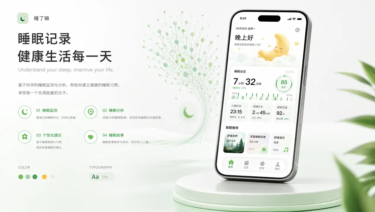
照片中提取一个UI界面在手机样机展示,有排版元素
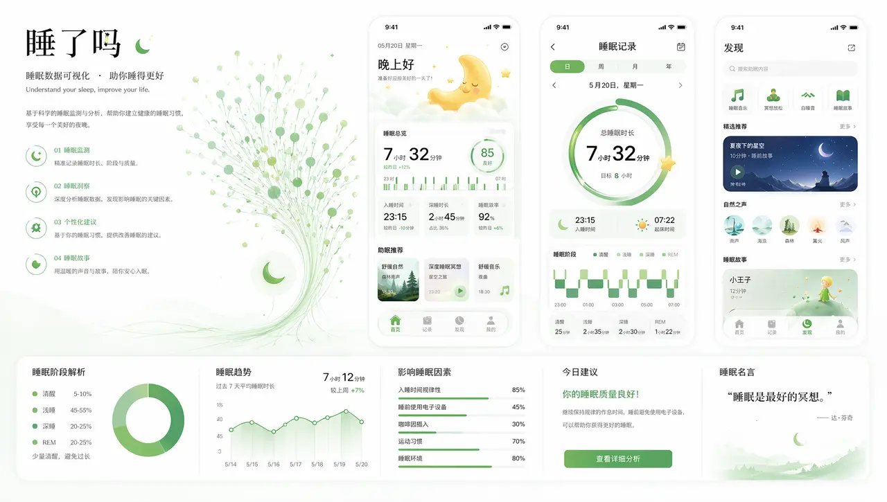
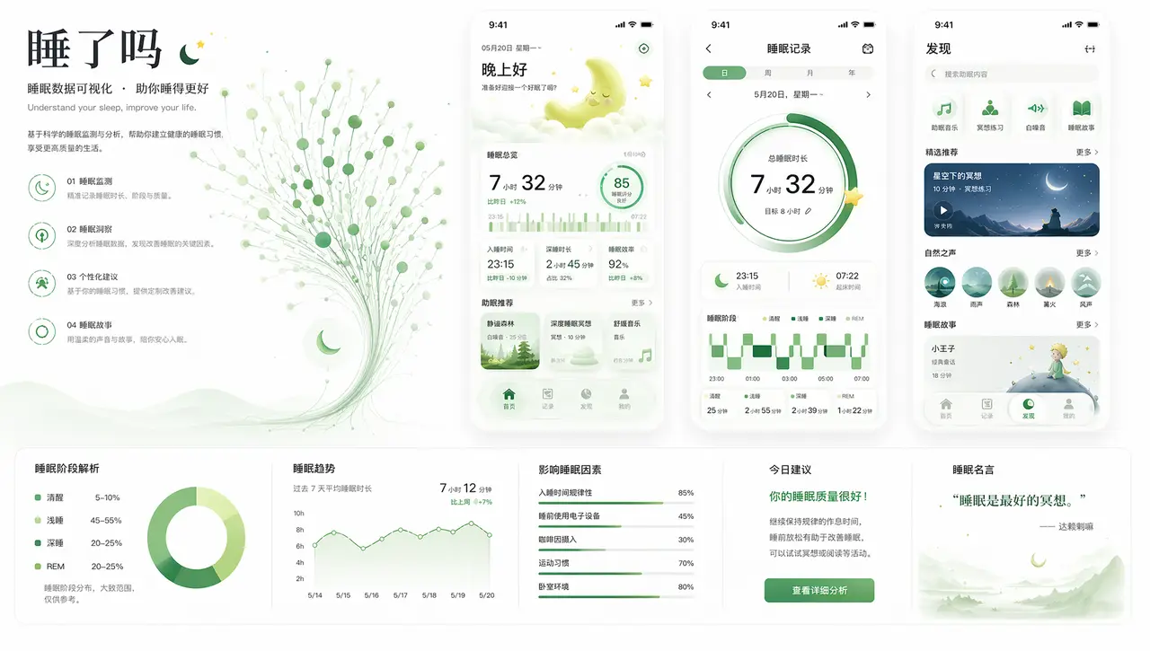
根据可视化设计风格,给出UI设计稿。图像底色为白色,UI上适当使用成绿色
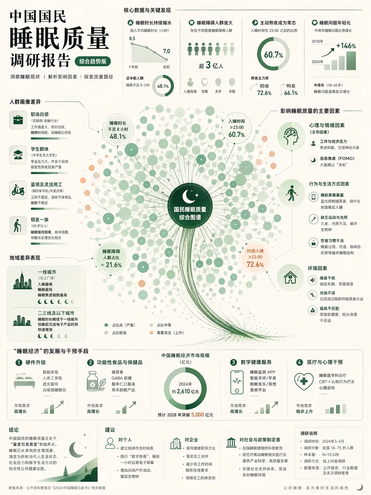
全中文展示生成关于中国人口睡眠质量的可视化调研报告,整体风格简约高级,整体为一图式,文字需要提炼,在图上较少,尽量都转换为可视化的图形设计
【生成内容】 ### 1. Overall Design Style (Aesthetic) - **Bio-mimetic & Organic Metaphor**: The design heavily relies on an organic visual metaphor—resembling a dandelion, a blooming flower, or a neural network. This transforms abstract data (likely network nodes, connections, or timelines) into something beautiful, natural, and highly engaging. - **Minimalist Elegance**: Despite the sheer volume of data points (hundreds of individual circles), the overall aesthetic remains incredibly clean and airy. It avoids "chart junk" and heavy structural borders, leaning into a modern, editorial magazine feel. - **"Macro-Micro" Readability**: It operates on two distinct viewing levels. From a distance, it reads as a single, striking piece of abstract art. Upon closer inspection, it reveals intricate, legible data clusters and detailed textual annotations. ### 2. Layout & Composition - **Decentralized, Expansive Centerpiece**: - Unlike traditional grid layouts, the composition is completely dominated by a massive, central **network graph/bubble cluster**. This central figure radiates outward irregularly, creating a dynamic, exploding sense of momentum. - The "stem" of this organic shape visually anchors the massive cluster to the bottom right, providing structural stability to an otherwise floating form. - **Floating Annotations (Constellation Layout)**: - Text blocks are treated as individual islands floating in the negative space around the central cluster. - They utilize delicate, precise **leader lines (callouts)** to connect textual explanations directly to specific, significant data points (larger bubbles). This creates a constellation effect, guiding the readers eye around the perimeter of the main graphic. - **Typographic Hierarchy**: - A bold, high-contrast serif font is used for the main title ("trending") in the top left, immediately establishing the subject matter with editorial authority. - The rest of the typography uses clean, highly legible sans-serif fonts in varying weights to differentiate body copy, data labels, and micro-text. - **Structured Footnote/Legend Area**: The bottom quarter of the page shifts into a subtle, rigid grid to house the necessary legends, methodology, and a secondary, traditional chart (a timeline/area chart), anchoring the organic chaos above with rational, structured information. ### 3. Color Palette & Tone The color strategy employs a **"Soft Pastel & Monochromatic Harmony with Subtle Accents"** approach: - **Background Base (Canvas)**: - An off-white, warm cream, or very pale ivory acts as the canvas. This prevents the harsh contrast of pure white, adding a subtle touch of warmth and print-like quality. - **Dominant Data Color (Monochromatic Shift)**: - The vast majority of the data points are rendered in varying shades and opacities of **soft, cool mint green / seafoam green**. - The use of transparency (alpha channels) allows the overlapping circles to create natural density maps—areas with more circles become darker and more saturated, intuitively showing concentration without additional colors. - The central "hub" and "stem" use a deeply saturated, dark forest green, establishing a strong visual anchor and contrast against the pale mint. - **Highlight/Outlier Accents**: - A highly constrained use of **soft peach / muted coral / pale orange** is applied sparingly to specific outer nodes. This complementary color contrast immediately draws attention to outliers or specific categories distinct from the main green mass. - **Typography & Line Art**: All text, leader lines, and structural elements are rendered in a soft charcoal or dark gray rather than pure black, maintaining the delicate, elegant tone of the entire composition.
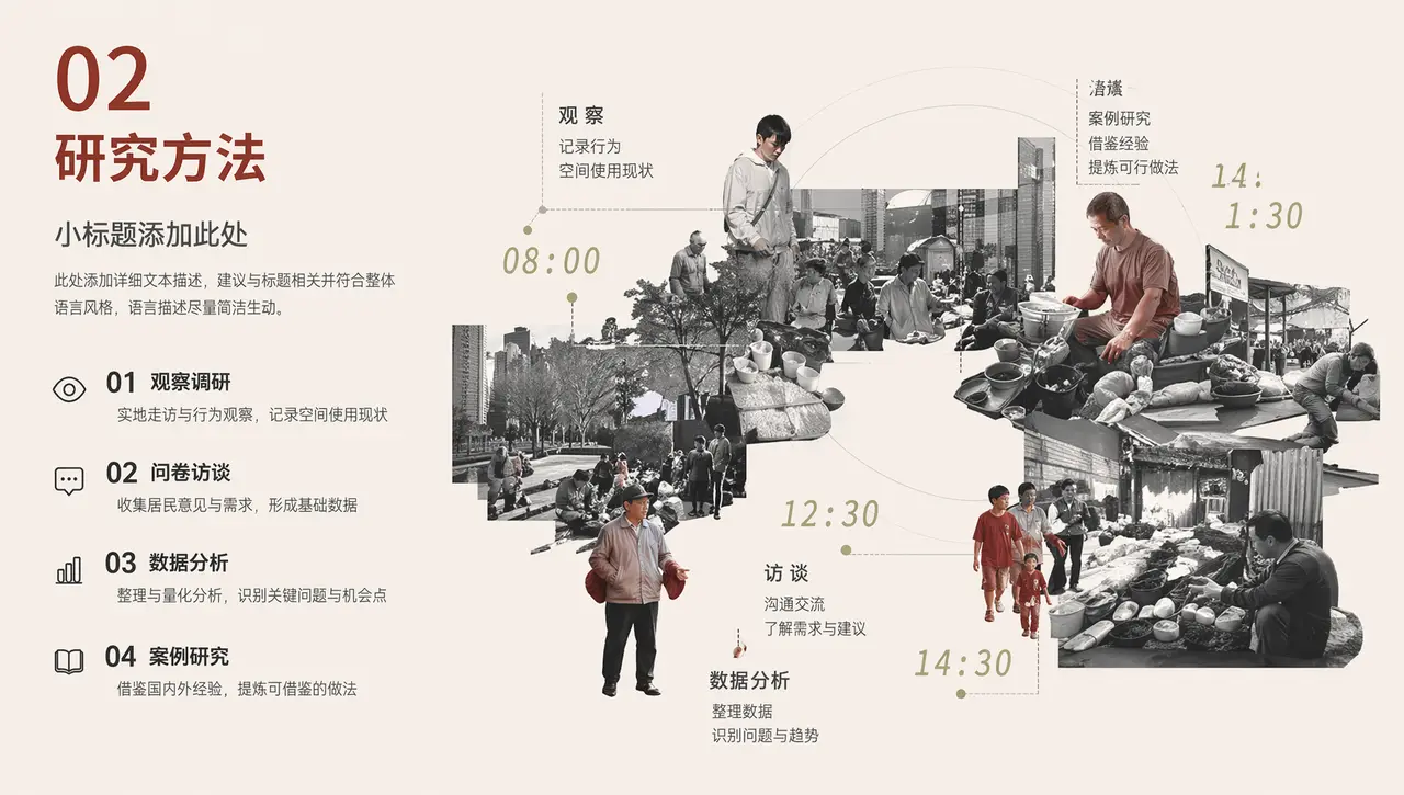
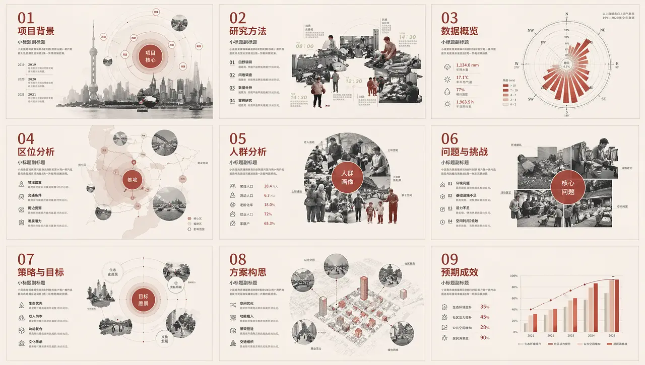
提取宫格内的第二部分的研究方法,优化文字内容
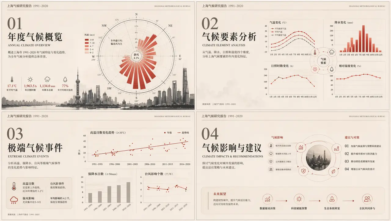
根据可视化设计生成一系列的PPT制作模板,要求是四宫格模式,分为不同的介绍板块,要求要有大标题,小标题,以及小字说明部分,以及同类型风格的可视化图形制作。PPT每个板块要有视觉中心。
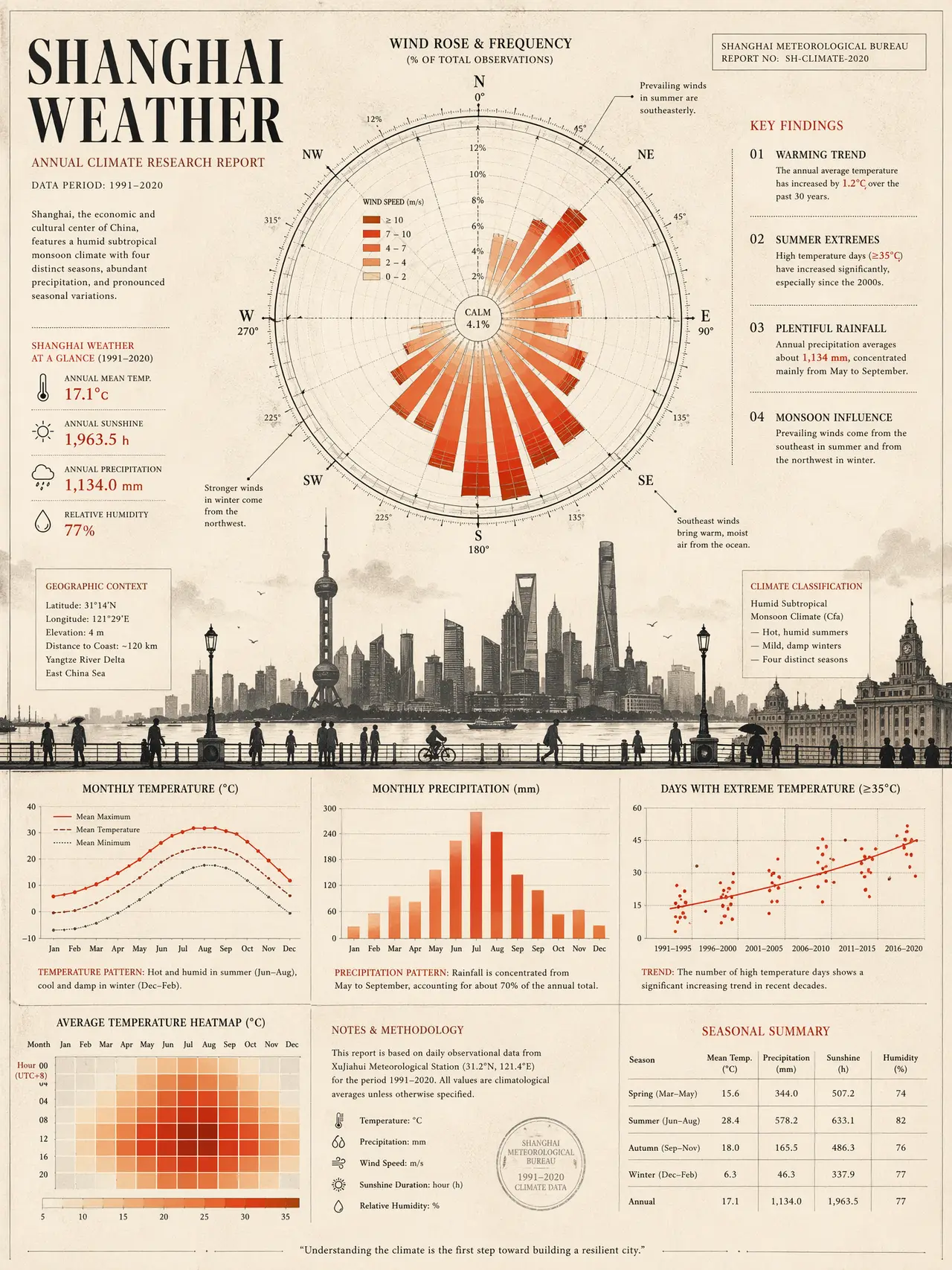
生成纯英文版本的关于上海天气的可视化调研报告
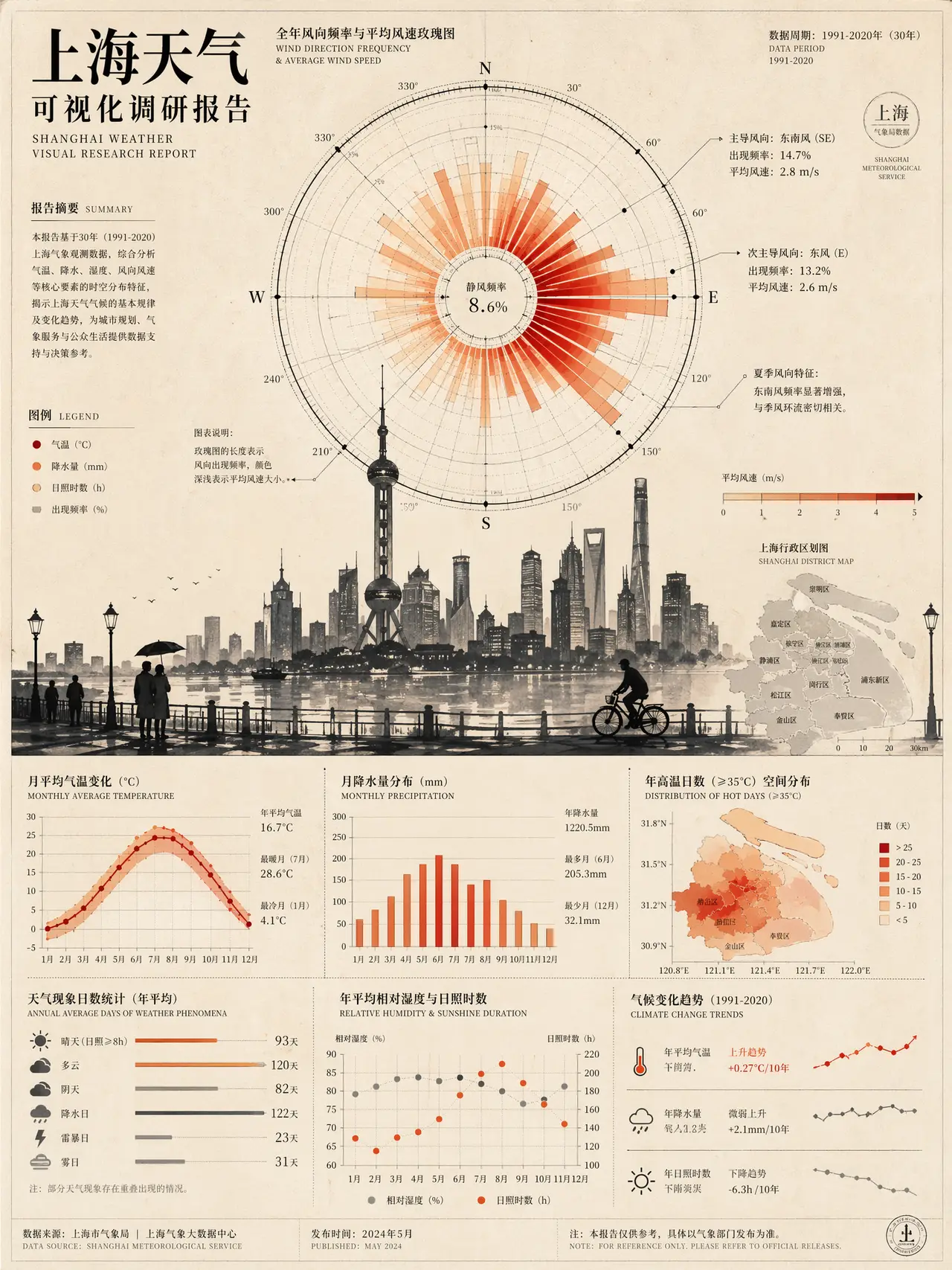
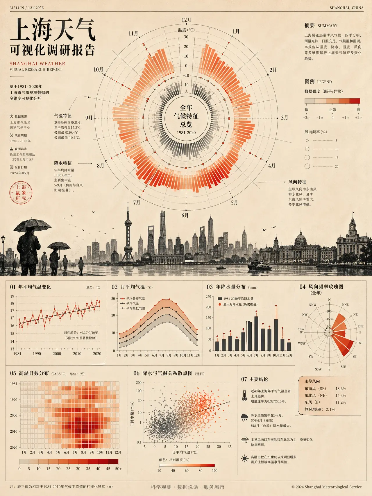
生成关于上海天气的可视化调研报告
【生成内容】 ### 1. 整体设计风格 (Overall Design Style) - **严谨与艺术的融合**:将硬核的数据分析与具象的城市剪影、精密的几何图表相结合,既保留了调研报告的学术理性,又具备极高的海报级艺术审美。 - **精密仪器感**:大量运用极细的辅助线、刻度、引线和散点,使得主图表看起来像是一个精密的仪表盘或科学观测仪器,传递出数据的准确性与权威性。 - **复古报纸/期刊风**:整体质感摒弃了现代数字屏幕常见的炫彩或暗黑风,转而模仿传统纸媒、科学期刊或档案文献的质感,带有一种温润的知识分子气息。 ### 2. 排版与布局 (Layout & Composition) - **强视觉焦点的“主次构图”**: - **视觉中心(绝对主导)**:画面中上部被一个巨大的、复杂的\*\*中心放射状图表(极坐标/玫瑰图变体)\*\*占据。它提供了极强的视觉抓力,打破了传统网格排版的沉闷。 - **次级信息区域**:画面下方则回归横纵网格结构,排列热力图/散点图与文字说明,作为主图表的数据支撑与补充。 - **巧妙的“视觉分割线”**:画面中部利用深色的**城市建筑与人物剪影**作为横向分割带。这不仅在几何图形(上下的抽象图表)之间形成了视觉缓冲,也将抽象数据与具象的物理世界(城市空间)联系起来。 - **模块化与图文穿插**: - 文字不再是单纯的阅读材料,而是作为“视觉灰度块”参与构图。 - 采用**引线标注法**(细线连接图表细节与说明文字),让复杂的图表具备阅读引导性(Reading flow),维持了画面的秩序感。 - **充足的负空间(留白)**:尽管数据密集,但四周和图表之间留有充足的底色空间,避免了视觉窒息感,让核心图表得以“呼吸”。 ### 3. 色调与配色 (Color Palette & Tone) 整体采用\*\*“暖调复古底色 + 强对比警示色 + 中性结构色”\*\*的色彩策略: - **背景底色(Base Tone)**: - 未使用纯白,而是选用了**低饱和度的暖米色/羊皮纸色(Muted Beige/Parchment)**。这种底色不刺眼,奠定了整张海报温润、高级、复古的纸质阅读基调。 - **数据强调色(Data Accent Colors)**: - 使用\*\*高饱和的红、橙、珊瑚色(Red-Orange Gradient)\*\*作为核心数据的映射颜色。在冷暖对比中,红橙暖色具有前冲感和警示意味,能够瞬间抓住眼球,直观反映数据的密度、热度或严重程度。 - **结构辅助色(Structural Colors)**: - 图表的轴线、刻度、剪影以及绝大部分文字均采用**炭黑(Charcoal)与深浅不一的冷灰色(Cool Grays)**。 - 黑灰色作为锚点,压住了红橙色的跳跃感,保证了画面的稳重与专业感。
【生成内容】 # ***01-电商详情页***